I was bought this book as a present recently and absolutely love its simple yet effective way it displays the alphabet. Each page consists of a letter from the alphabet (sometimes two letters on the same page) and by turning the page the letter is revealed in 3D format. It uses a simple colour palate of red, white and black which bring the book together to look really slick and neat.

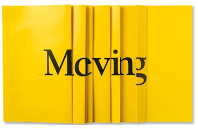
I began looking into other types of pop up typography and was reintroduced with a campaign that Craig Oldham worked on whilst at The Chase, which was to let people know that The Manchester Evening News was moving address, which allowed the audience to interact with the leaflet to discover the purpose.
 What I love about this design is that the answer to the brief was always there, and sometimes that 'oh so obvious answer' doesn't always seem apparent and you can be lead down trivial paths trying to figure out the right way to go. This just reminds me that keeping it simple can often, be just as effective, and allowing the audience to be involved in the process is a key way to make the design memorable.
No comments:
Post a Comment